Monday, December 10, 2012

Door-Yard Roses 2

This is nearly finished. The photograph was taken in poor light, and slightly enhanced in Photoshop  such that the reds in the roses are too strong; otherwise it is reasonably faithful to the original. The sage leaves were gone over with Sennelier soft pastels and the rosemary was added with pencils and Sennelier. I had another go at the roses, after fixing to get some more tooth -  the paper is Canson Mi-Teintes Touch, which I have used for the first time; it does not take the same extent of overpainting that my usual support -  Clairefontaine Pastel Mat - does. The original is 24 x 16 inches, or 60 x 40 cms.
There is a design, or a compositional element underpinning this painting, in that the eye is meant to be led through a reverse-s pathway, like the shape of the number 2, starting at the roses on top left,  following their trail down to the edge of the large jar, and exiting via the sage leaves. 
“Dooryard Roses”  © Niall O'Neill

Wednesday, November 28, 2012

Door-yard roses

I must admit that I have never to date used the term "door-yard" and I am familiar with it only through Walt Whitman's poem When lilacs last in the door-yard bloom'd. However, a close friend of mine has a walled patio in France, with roses over the door, and he asked me to paint the scene for him. So, here it is, door, yard, and roses instead of lilacs. There is sage and rosemary too.

The first picture is the underpainting, and because of the complexity of the foliage and background, I reduced the original photograph to 16 colours in Paintshop Pro, and based the underpainting on that, choosing only 16 pastels nearest to the colours in the altered image.

The second picture is a development of more colours, still using pencils and Rembrandt, but also moving into Sennelier and Schminke where the colour was needed. The work is progressing in the main from top left to bottom right, although I went vertically down the left side to work on the door, the big pot, and the ground. I was surprised to see the profile of Julius Caesar appear on the pot...


The third picture has some more detail on the roses, after fixing. I am working on darkest darks and lightest lights to gauge maximum contrast; and a new palette of colours has been introduced to work on the sage leaves.


To be continued.....

Tuesday, November 27, 2012

Victor Richardson in the Pastel Journal


My article on Irish artist Victor Richardson is published in the December issue of the Pastel Journal, and his work was chosen for the cover of the issue. The magazine is on the bookstands, but is also available as a digital download from the North Light shop.

Ellen Eagle: Pastel Painting Atelier

A new book on painting in pastels is always a welcome event in publishing. It is even more welcome when the book is by somebody who is as thoroughly versed in their art - and craft - as Ellen Eagle. (You can find out more about Ellen on my blog artistsinpastel.com)
Ellen's new book is called Pastel Painting Atelier – Essential Lessons in Techniques, Practices, and Materials.It is published by Watson Guptill; and Crown Publishing,and costs $35 US or $41 Canada.
It is also available as an ebook. Publication date is April 23, 2013!


Tuesday, October 9, 2012

New work

It was not possible to bring a full set of pastels to France this year, so I settled for the most compact pastels that travel well - pastel pencils. These images that follow are paintings that I started in France, with the intention of finishing them on my return to Ireland with the benefit of a complete range of Rembrandt, Sennelier and Schminke.
So, what I am showing here has been done solely with hard pastel pencils. There is much more to be done.

I have always had a fondness for orchids, having grown them for a time, bit never anything as exotic as the tropical slipper orchids, such as this Paphiopedilum parishii. There is a version in oil on my Facebook page, in the paintings folder.


Every home has a collection of scent bottles, some quite exotic in their conception. They make challenging and colourful subjects for still life.


Our kitchen windowsill has a small Tiffany-style lamp sitting on white tiles, and lighting up the oil bottle. I wanted to highlight the contrast in this one.


Saturday, September 22, 2012

The Little Gallery, St.Emilion

I have just returned from a few days in St. Emilion, posibly the most famous town  in the heart of the Bordeaux wine region - certainly very pretty, very popular, crammed with restaurants and wine shops (apparently over 80 at last count). 
However, my reason for being there was to hand over a pastel to Elena at the Little Gallery, who had seen my paintings at the pastel exhibition in St. Aulaye this August and who expressed an interest in displaying them. It was a great experience to have my work hanging with artists of the calibre of Roy Petley and Vicente Romero.
The photographs show me emerging from the gallery looking not too smug, I hope, and another where you can just make out my pastel of a pitcher with a hellebore in the window display.

Friday, July 13, 2012

Vicente Romero

I have already posted on Vicente Romero on artistsinpastel.com. I am returning to this artist because I had the pleasure of meeting him in Saint Aulaye in the Dordogne last summer. Our meeting turned into an interview, which evolved into an article in the Pastel Journal, and this has just appeared in the August 2012 issue.
The magazine is already on its way to subscribers, should appear in the shops soon, but it also available as a digital download at http://www.northlightshop.com/pastel-journal-august-2012-digital-download-v9088/?lid=pasjcnl071012&et_mid=566757&rid=2791283
Overall it's an excellent issue, including not only Vicente Romero, but also Ken Gofton on Michael Norman, Aaron Schuerr on Sheila Rieman, and a demonstration by Sarah Blumenschein on her approach to still life. Unmissable.  Incontournable.

Tuesday, July 3, 2012

Pitcher and moth

It is July 3 in Ireland, and since my last post it has not stopped raining. On the bright side there's no gardening to interfere with painting.
This pitcher is giving great inspiration. The honeysuckle was growing in the garden, and the elephant hawkmoth is a species I have raised from larval stage. I decided to combine the lot in a composition that is not outlandish, zoologically speaking - the hawkmoth visits honeysuckle in the evening.


First sketch. The layout and placement are sketched fairly loosely with pastel pencils. I have already started to develop the blossom.
In order to get an idea of the contrast and too allow for a dark background for the stamens, I have rubbed black pastel pencil in firmly around the flowerhead.


This is the completed sketch and block in. It needs to have the dark background added soon to finalise the colour contrast.
This image is showing me that the colour of the back of the leaves is too light.


This is a close-up of the pitcher. It has more colour than my previous treatments of the subject.
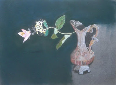
This is where I've left it for now. It will need some refining, but it can sit in the dark for a while, until  I view it afresh. The painting is on Clairefontaine's Pastelmat, 11 x 14 ins.


Monday, June 18, 2012

Le Palais Briaud II


Interior, Palais Briaud  © Niall O’Neill
I think I'll stop now. Did some work on the doors, panels and knots; added some shadow; and refreshed the flowers on the table; repainted the lampshade; and "distressed" the wallpaper on the right. The photo was taken with a flash so it's a bit washed out, but it's been raining so hard in Cork today it's like being in Seattle, and there's no daylight to speak of.

Thursday, June 7, 2012

Summer shows in France 2012

The French Pastel Society has three shows coming up this summer and autumn, in Saint-Florent, Feytiat, and Montluçon. Vicente Romero is the guest artist in Saint-Florent; he is also the guest artist is Saint-Aulaye in the Dordogne, where the Salon International du Pastel takes place from August 2 to 26th. (On a personal note, I have two paintings juried into this show - the two still life paintings on this site that feature the old brass pitcher).
There is also Salon du Pastel en Bretagne from18 August to 2 September 2012 and the Art du Pastel Rhône-Alpes, 5th to 16th September. 
So plenty of top-class artists to be seen no matter where you are in France.
La Société des Pastellistes de France a trois spectacles à ne pas manquer cet été, à Saint-Florent, Feytiat, et Montluçon. Vicente Romero est l'invité d'honneur à Saint-Florent; il est également l'invité d'honneur Ã   Saint-Aulaye en Perigord, où le Salon International du Pastel aura lieu du 2 au Août 26.
Vous ne devez 
non plus manquer  le Salon du Pastel en Bretagne du 18 Août au 2 Septembre 2012 et l'Art du Pastel Rhône-Alpes, du 5 au 16 Septembre.

Tuesday, June 5, 2012

Le Palais Briaud

Le Palais Briaud is an Italianate mansion overlooking the village of Varades, just north of Saint-Florent-le-Vieil on the River Loire. It was built sometime in the 1850s or thereabouts by a French railroad magnate who made his fortune building railways both in France and in Italy (hence the architecture). We found the palace in Alec Sawdays special places to stay; it is a bit run down, and some outbuildings are entirely in ruins. But the main house is still very fine, with many original features and furnishings. 
The painting is of a small corner of the first floor landing, which stretches from front to back of the house with the bedrooms off; there are at least two small sitting rooms, this being the open one. I thought it made a useful still life - I like to "find" them instead of setting them up. There is still work to be done on the doors in the background; the way the light fades from left to right is partly deliberate, but the camera has exaggerated the effect the the right side is not so pallid in reality. The two small paintings in the top right corner are unidentifiable in my reference photos, but I painted a pair of vintage locomotives, in the spirit of the original owner. The support is Clairefontaine's pastelmat, 27 x 19 ins.

Monday, June 4, 2012

Vase on locker

I had a photo that I took of the bedside locker in France with a cheap old vase picked up in a brocante, and some dahlias from a neighbours garden. The support is ArtSpectrum sanded (and wettable) paper.
Initial block in was with Derwent Carmine for the dahlia, Rembrandts for the background and Carbothello pencils for detail over Schminke soft greys for the porcelain and the locker.


Nearly there at this point. Needs a few missing details on right leg of locker, dahlia must be sharpened etc. I found that the Schminke is so sofe it has taken up all the tooth and when I tried to work further on locker edges and contiguous background the support was not at all receptive and began to get very sulky, losing all tooth and refusing to accept any pastel at all. I tried masking off the affected area and spraying with fixative, but that was not very useful; so I ended up by brushing off all pastel from around the affected area and painting a thin layer of acrylic gesso on the support. This gave me the tooth I needed to finish.


Saturday, May 12, 2012

As they say in French, j'ai ravisé.
I put the painting aside - I normally leave it for longer than I did, but the reflection niggled at me. I wasn't satisfied. So I rechecked the photo portfolio I had taken of the set-up (I always photograph my still life set-ups, from different angles, different exposures etc to cover all bases). I decided that a photo that displayed more of the reflection was what I was after, so I brushed off the excess pastel (out of doors) that was covering the area I wanted to alter. I then turned the photo and the painting upside down, drew in the outline of the new relected dalla, and used a mixture of Rembrandt burnt umbers 403.3 and 403.5 series, and Sennelier Olive Grey 449/450 to paint the reflection. Highlights were added in Caran d'Ache pencil and diffused, then a spot of Sennelier Naples Yellow 103 dabbed into the centre. Background repairs were done with the Sennelier Lamp Black, and the painting put behind glass so I can't touch it again without the bother of unsealing and unframing it.

Friday, May 11, 2012

East meets West II

I think I'll leave it at that. What sharpening I did was achieved by using Sennelier Lamp Black in the background at the bottom; and tightening up the pods with my new Caran d'Ache pastels, that will leave a mark on a soft pastel substrate. I must try another painting using these as the main pastel to roadtest them further. The reflection of the dalla was achieved by drawing and rubbing it in firmly before applying the background; then erasing the background to reveal the gold ochre underneath.
By the way, the Sennelier Lamp Black must be the most friable of the Senneliers - it is basically soot mixed with the absolute minimum of binder - there is no way you can use it for detail. And when you make a mark with it, it looks like a grey piece of burnt paper ash sitting on your support until you rub it in and get the black you are seeking.


Tuesday, May 8, 2012

East meets West

Recently someone gave me a gift of a Nespresso coffee machine. The Nespresso set-up is a real marketing success - sleek presentation, neat pods, great accessories - and the coffee's good too!
Somewhere in the studio I had saved a brass Arabic coffee pot or "dalla"; I thought the modern pods and the dalla might make a nice combination.

The paper is my favourite Clairefontaine Pastelmat, in a sort of mouse grey shade. I decided to do a colourful underpainting based on a posterized photograph of the set-up.


In the picture on the right I have started to work on the lid. I used mainly CarbOthello  pencils in shades of ochre and brown, and put a dark outline around the "spire" in order to get a real idea of the contrast.
The lid is finished and I have moved down into the body of the dalla. This is where the softer Sennelier pastels come into play.


The pot is finished and there are some surprising colours in it, including a pale lilac running down the right edge - a little in the lid, more in the curves of the concave to convex area.

The pods have been started off too.
They need to be finessed, the bottoms made more rounded, the foil tops tightened, especially at the edges. This is the point at which the pastel pencils are impractical, as working had over soft is tricky and some pencils just won't take. (I can't wait to try out the new range from Caran d'Ache - they are meant to be easily grabbed even at this late stage of the painting.)


Saturday, April 28, 2012

Gallery Outlet

Regular viewers will know that this blog has no commercial interests, accepts no advertising, and has no sponsors. However, for the first time I am offering giclée editions of some of my own work, on premier quality German Etching Paper, in a strictly limited edition of 50 or 100 only signed prints. 

I have added a new Gallery Outlet page to the site, where the prints are illustrated and listed for purchase. All details of prints, postage and payment methods will be found thereon.


Friday, March 30, 2012

Pitcher picture 4

I think I am almost there with the pitcher and hellebore. The background has been filled in, with the shadow to the right - I had to use black to make it stand out from the dark blue and green base colour, but the black (Sennelier Ivory Black)  has been scumbled over the base, so it is not quite as stark as it might otherwise have been, and I have softened the edges of the shadow, although it was quite sharp in reality.
I have moved into soft pastels, using Sennelier and Schminke -  and some Rembrandt both in the background and foreground. There are still refinements to be made before I sign this, but I will frame it with 6 mm spacers separating it from the glass, and no mount, all of which will enhance the effect.

Wednesday, March 28, 2012

Pitcher picture 3

This is really a very poor photograph - the auto setting on my camera simply cannot deal with the range of contrast between the background and the subject. However, here is the final image. Note the found edges on the right, where the light comes from, and the lost edges on the left.
The main change from the last image is of course, the dark background mix of Sennelier dark green  - 179 - dark blue and brown. I have tightened up the lettering on the brushes, and added some colour notes on the pitcher - mainly shades and tints of olive green and gold ochre. Little dots of light and dark gray for the "distressed" areas of verdigris to finish. And finally some Schminke greys for the foreground and middleground - these are labelled neutral, but I find a distinctly brown tendency in them.


Monday, March 12, 2012

Pitcher picture 2

This is stage 2 of the pitcher picture with paint brushes. I have started to introduce some subtle colour into the greys of the undercoat, mostly yellow and gold ochres, but also some olive greens. The brush handles have some ochre, reds and browns. I have also started to block in the background in order to judge the tones. The background is not black - there are darks blues, greens and browns in it.
I changed the position of the front leg of the vessel - it is in fact a little bent in reality, but I thought that it looked like an error on my part, rather than a flaw in the pitcher, so I "fixed" it!


Wednesday, March 7, 2012

Pitcher picture 1

These two images are the first stages of a still life that I have set up with a small brass pitcher covered with dust and verdigris that I absolutely refuse to polish off!


The first image, with the paintbrushes, shows a selection of greys down along the left side that I chose for the first layer. From the top down, there are seven CarbOthello pencils; then seven Rembrandts; followed by nine Schminke neutral greys from dark to light - they have a distinctly brown tinge compared to the others - useful fro the brass. Then there are six Sennelier and finally three Derwent pencils. Needless to say, the paintbrushes were done with further colours.


I have used the same set of greys for the second image, apart from the hellebore, where I used only Derwent pencils. In fact, both images have made use only of the CarbOthello pencils to this point in the process. The next layer will introduce more colour - probably the Schminke, but by no means confined to these.

Friday, February 17, 2012

Le bougeoir framed

This is the framed painting of the Spanish candlestick, as promised.
.

Le bougeoir espagnol

Bougeoir espagnol is French for Spanish Candlestick, but of course you knew that.  I didn't keep many notes on this one. The support is Pastel Mat, and this first image is of the dark background filled in around a lightly-drawn candlestick which has had a wash of alcohol before moving on to softer pastels. 


The second image is the finished piece. I used mostly Sennelier pastels, with a touch of Schminke for the deep reds, and pastel pencils for the matchsticks. Image size is 9 x 6.5 ins. or 23 x 16.5 cm. I did not use a mat when framing, but stuck the support onto a backing piece of mat board to stiffen it, and made up a wooden fillet, painted black, to keep the image away from the glass. I'll post a picture of the framed piece if I can photograph it without too many reflections.

Saturday, February 11, 2012

Hydrangea

This is a painting that I did last summer of a hydrangea blossom that has thrust its way through a neighbour's fence. I called it "Don't fence me in". I had not photographed it as I worked on it, but I can tell you that it's entirely composed of Rembrandt pastels on Clairefontaine Pastel Mat. Rather than do a blow-by-blow account of it, I have posted some close-up pictures of a few details. The original is 26 x 36 cms. or 10.25 x 14.5 ins. approximately.

I left most of the florets somewhat vague, but I did work on this single one to provide a focal point in the blossom:
This is a close-up of one of the shadow areas, with a sketchy showing of a leaf in the background:


And this is the single water droplet I included in the painting (less is more). You can see that there is not much to it: