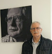
Sunday, December 14, 2014
Portrait of K #III
Thursday, December 11, 2014
Portrait of K #II

Wednesday, December 10, 2014
Portrait of K
It's been a while since I posted any work on this blog, and I am breaking the logjam with a child's portrait - an unusual departure for me, as I usually stick firmly to still life. This was a challenge - doubly so as the contrast and information in the photos I had to hand were not really adequate. There is so much more character in an older person's face, that I found the smooth tones and transitions in a child's skin far more difficult to interpret.
I started out with a chosen photo, and reduced it in Photoshop to 16 colours, as is my normal practice. However, I did not use this posterized image as an underpainting on this occasion, but kept it beside me for reference as to the outlines of the value changes.
 The first layer was put in using only hard Nupastels and Derwent pencils in shades of Burnt Sienna, Brown Ochre, Terracotta, Spectrum Orange and Orange Earth.
 This first layer was lightly blended by my fingers before proceeding - no fixative was used at any stage.
 I started to lightly stroke Rembrandts in lightest tints of Burnt Sienna, Gold Ochre and Orange, and roughed in the shirt and side of the head,
 This is a shot of my armamentarium! There are few light greys out of shot - and black!

 These are the skin tones I used - I compared them on a grey background, as my support was too close in colour to use for this.
Nearly there. Some adjustments were needed in the lightest lights on the face, to soften transitions and adjust the areas occupied by the lights. Some Jackson soft pastels and also Blue Earths were used for rich darks in the hair.
 Final result - the only thing left to decide is whether I will paint in a background (there is a red brick wall in the reference photo) or leave it stand.
I started out with a chosen photo, and reduced it in Photoshop to 16 colours, as is my normal practice. However, I did not use this posterized image as an underpainting on this occasion, but kept it beside me for reference as to the outlines of the value changes.
Tuesday, October 14, 2014
Colour Analysis of Pastels by Paul Centore

I wish to bring my readers' attention to the work of Paul Centore, as expressed on his pastel colour website, Colour Science for Painters, a website that applies colour science to understanding of the use of colour in painting, in particular with pastels. Paul's analysis depends on the use of the Munsell system's concepts of hue, value, and chroma, which are fundamental to understanding colour in painting.
While the website is somewhat technical, the results Paul achieves are fascinating, and the pages on Colour Analysis of Pastels, with links to pdf documents of the work carried out on Rembrandt and Unison brands respectively give an idea of what Paul is faced with, as he intends to apply similar techniques to analysing more pastel marques.
In order to progress his work Paul requires the cooperation of keen pastel artists, in particular those who possess a comprehensive range of a particular brand. How one can assist is explained on the website - rest assured, you do not have to part with any of your precious sticks!
Friday, October 10, 2014
Lucien Lévy-Dhurmer
A three month break from this blog saw me return last week to a PC which showed its objection to its lack of use by promptly crashing when I turned it on. Windows stubbornly refused to load. I had to find the original recovery disks and laboriously re-load all the software before getting back to business. Painting is easier!
Regular readers of the Pastel Journal may have noticed the last page of the October 2014 issue featured Woman with a Medallion by Lucien Lévy-Dhurmer in the Great Pastels series. This piece was a considerably abbreviated version of the original article I wrote for the Journal. Here is the complete article.
Lucien Lévy-Dhurmer was born Lucien Lévy in Algiers in 1865, to Solomon Levy and Pauline Amelia Goldhurmer. He returned as a boy with his family to France and in October 1879, at the age of 14, he began studying at the École communale supérieure de Dessin et Sculpture, and was accepted at the Paris Salon of 1882, well before he had finished schooling, showing a small ceramic plaque featuring the Birth of Venus in the style of Alexandre Cabanel. From 1886 to 1895, in need of money, he began as a ceramic decorator and climbed to artistic director of the studio of Clément Massier at Golfe Juan, near Cannes on the Côte d’Azur. He became known for his experimentations with metallic luster glazes based on Middle Eastern and Hispano-Moresque pottery, and around 1892 on becoming director he co-signed his first pieces of ceramics together with Clément Massier. Meantime he continued to paint in oil and pastel, exhibiting in Paris with the Peintres de l'âme in 1894 in a show organized by the journal L'Art et la Vie. In 1895, nearing his thirtieth birthday, Lévy travelled to Venice and Florence, where the work of da Vinci and the Renaissance Masters had a profound influence on him. The trip markedly re-focused him on his earlier artistic ambitions. He returned to Paris and his art.
In Paris he settled in a studio down the road from Gustave Moreau’s in the ninth arrondissement. The Belgian poet Georges Rodenbach, through a mutual friend, soon invited the young artist to lunch; he wanted Lévy-Dhurmer to draw his portrait. The portrait, now in the Musee d'Orsay, is a testimony to the rapid friendship coloured with mutual respect which grew up between the two men. In it the poet is shown full face against a background suggestive of the town of Bruges in reference to the book which made Georges Rodenbach famous: Bruges-La-Morte.
Thanks to Rodenbach, Lévy had his first solo exhibition in 1896 at the Galerie Georges Petit under the name Lucien Lévy-Dhurmer (he'd added the last two syllables of his mother's maiden name (Goldhurmer), in order to stand out from other Lévys.) He showed a series of 24 works including 16 pastels, 2 chalks and 5 oils paintings, some of which are today among his better-known works - Bourrasque, Le Silence, Portrait de Georges Rodenbach, Eve, Mystère. This location brought him immediate celebrity, as the gallery was known for showing only recognised artists and those with an international reputation. One critic proclaimed him “a youth, a debutant and also a master,” asking rhetorically if the artist was “Symbolist, Mystic, or Romantic.” Another critic likened him to "da Vinci, Botticelli and Memling, the ancients, the moderns…" He also attracted the attention of artists like Émile Bernard, and Gustave Moreau. Georges Rodenbach introduced him to Pierre Loti, whose portrait he painted, with the Bosporous as the background. "In the twilight Stamboul of Loti's portrait, I have lit little lamps today, which are reflected in the Bosporus, and which are the small trembling souls of Aziyade and Achmet," he wrote. Loti thanked him most particularly in a letter:
"I often reproach myself that I have not thanked you enough for painting the only image of me that will survive.”
His paintings and his style of hazy academicism was appreciated in equal measure by the public and by other artists. Poet, critic and resistance leader Jean Cassou has pointed out: '[Lévy-Dhurmer's] pastels reveal an artist who can reconcile a technique of academic precision with an Impressionist vision of the world, and can thus treat his Symbolist subjects loaded with mystery.'
After 1901 Lévy-Dhurmer moved away from expressly Symbolist content, except in some representations of women illustrating the music of Ludwig van Beethoven, Gabriel Fauré and Claude Debussy, and in some landscapes, although he was already incorporating more landscapes into his work because of his travels in Europe and North Africa. Travelling in North Africa and then Turkey he made greater use of pastels, easier to carry and use when traveling, and they remained a favored medium throughout his subsequent career.
He participated in some group exhibitions, was a regular at the Salon d'Automne, and had 8 further solo shows. After 1900 he experimented with a technique of using diffuse restricted colours, often with a bluish tint, which he continued with up to his death, long after Symbolism had been forgotten.
Around 1910, he began to explore the process of interior decorating, leading to a commission from Auguste Rateau (1863–1930), for his apartment at 10 bis Avenue Élysée-Reclus, near the Eiffel Tower. Rateau was an engineer who manufactured internal combustion engines and a member of the Académie des Sciences as well as an art connoisseur with a particular interest in the Art Nouveau movement. Lévy-Dhurmer, like many of his contemporaries (such as Josef Hoffmann in Austria, Charles Rennie Mackintosh in Scotland, and Frank Lloyd Wright in America,) worked as an ensemblier, conceiving interiors as "total works of art" by designing not only the architectural setting but also everything that went into them.
The Wisteria dining room room and all its contents were thus conceived as a unified whole and were created in 1910-1914. Lévy-Dhurmer incorporated the wisteria motif throughout the room: the canvases, painted in the pointillist style, depict herons and peacocks standing in wisteria-laden landscapes; the book-matched walnut-veneered wall panels are inlaid with purplish amaranth wood representing clusters of wisteria blossoms; tresses of wisteria flowers and leaves are carved on the furniture and even stamped on the leather upholstery. The motif is detailed on the door handles, drawer pulls, and the gilded fire screen. The standard lamps represent the twisting vines of the wisteria liana. Lévy-Dhurmer was also responsible for a number of other rooms in the apartment including two salons, a library, and a study decorated with a frieze of stylized turbines and mechanical parts. (The Wisteria dining room was purchased in its entirety in 1966 by the Metropolitan Museum of Art, and is on view there in Gallery 813.)
In an article “Modern French Pastelists: L. Lévy-Dhurmer” published in The Studio in 1906, the critic Frances Keyzer, wrote: “A determination to master the mysteries of his art, an astonishing power of draughtsmanship. taste of a rare order, a flexible and delicate fancy, a genuine love of all that is exquisite and subtle, without any trace of affectation, a fine sense of order and harmony of line and colour — these are the qualities by which the work of this versatile genius is distinguished.”
She continues: “His paintings and pastels are generally one-figure studies; but the significance of each picture is conveyed as much by the background and surroundings as by the figure itself. The surroundings play a special and important part in this artist's work, for they are almost invariably imaginative, or efforts of memory. In other and less able hands such a proceeding might affect the earnestness of the work, but that clearness of vision which is one of M. Levy- Dhurmer's salient characteristics enables him to reconstitute and reproduce a landscape that has impressed him. In fact, the painter not only sees again the rocks and the trees, the hills and the valleys he has admired, but the same sensations that moved him at the time are revived in him with scarcely any diminution of strength.”
Lévy-Dhurmer used pastels a great deal, the medium readily lending itself to the magic of symbolism; several of his contemporaries, particularly Fantin-Latour and Fernand Khnopff, were equally attracted by his pastel technique. He was influenced by the ideas both of Khnopff and the Pre-Raphaelites, by Puvis de Chavannes and by Florentine and German painters of the XV-XVI century. This is particularly evident in the Femme à la médaille, 1896, Paris, Musée d'Orsay ; and in l'Automne, 1898, Saint-Étienne).
A contemporary critic, George P. Landow, Professor of English and Art History Emeritus, Brown University, makes this observation: “Take as a point of comparison the exquisite hard-edge pastel portraits of Frederick Sandys, a late-Pre-Raphaelitesurvival, and set them next to Dante Gabriel Rossetti's Fair Ladies — single portraits at the opposite ends of Pre-Raphaelitism, the first set in bright clear light, the second in inner worlds of mood and emotion. Lévy-Dhurmer's soft-edge, often dreamy works move farther into a subjective inner world of memory, reverie, and desire.”
A great traveller, to Italy, Spain, Turkey, Morocco, and Brittany, Lévy-Dhurmer's went through a realistic period where his works expressed simply the warm colours of nature or the curious personality of his models. This, in the first decade of the century, was when he produced much of his best work, notably Les Aveugles de Tanger, 1901 (Paris, Musée National d'Art Moderne), and the Mère Bretonne (Musée de Brest). He then tried to fashion a synthesis between reality and his artistic intuition, but he remained above all a master of esoteric Symbolism: he preferred to evoke mysterious appearances, distant faces with a mysterious pallor, such as Le Silence, 1895, a picture that Levy-Dhurmer kept throughout his life, and one of his most fascinating works. There is no clue to identity, or location; it is timeless, devoid of context, making it thereby both symbolic and universal. It owes something of its intensity to the use of pastel , the hatching strokes makes the whole image shimmer.
In 1899 the critic Achille Ségard likened the face to "that of a statue". He was perceptive. For although Lévy-Dhurmer was influenced by the historical iconography of silence, as expressed in the depiction of Horus, the Egyptian deity, he took his inspiration more directly from the medal sculpted by Auguste Préault for Jacob Robles' tomb in the Père-Lachaise cemetery.
Exhibited in Paris in 1896, and again at the end of 1899 and the beginning of 1900, Le Silence fascinated his contemporaries, and had a major impact on the Symbolist generation from Fernand Khnopff to Odilon Redon. It was acquired by the collector Zagorowsky in 1953, just before the artist’s death, and passed to the Bobritschew collection in 1976; the French state acquired in it lieu of death duties in 2006, and it now resides in the Musée d’Orsay.
Exhibited in Paris in 1896, and again at the end of 1899 and the beginning of 1900, Le Silence fascinated his contemporaries, and had a major impact on the Symbolist generation from Fernand Khnopff to Odilon Redon. It was acquired by the collector Zagorowsky in 1953, just before the artist’s death, and passed to the Bobritschew collection in 1976; the French state acquired in it lieu of death duties in 2006, and it now resides in the Musée d’Orsay.
His exquisite portraits include those of Rodenbach (1896), Pierre Loti (1896), and Natalie Clifford Barney, (1906)notorious salon hostess and daughter of American painter Alice Pike Barney. (In 1882 Barney and her family spent the summer at New York's Long Beach Hotel, where Oscar Wilde happened to be speaking on his American lecture tour. Wilde spent the day with Alice and her daughter Natalie on the beach; their conversation changed the course of Alice's life, inspiring her to pursue art seriously despite her husband's disapproval).
In 1914, when he was forty-nine, Lévy-Dhurmer married Emmy Fournier, nine years his senior, who had been an editor of the early feminist newspaper La Fronde until it ceased publication in 1905. By this time he was working primarily on landscapes, both oil and pastel, in a style similar to Whistler and Monet. He died in Le Vésinet, Yvelines, in 1953.
The painting La femme à la médaille or Mystère, ( Woman with Medal, or Mystery) was until 1972 in the collection of M. et Mme Zagorowsky. It was accepted as a bequest to the French state and destined for the Louvre, but it was assigned to the Musée d'Orsay, Paris, where it may be seen today. (Lévy-Dhurmer's work was amassed by art collector Zagorowsky, whose magnificent bequest, exhibited in March-April 1973 at the Grand Palais (Paris), was divided between the Parisian Musée d'Orsay and Petit Palais, and the museums of Beauvais, Brest, Gray, Pontoise, Saint-Étienne and Sète.)
This painting is well named Mystère. It is done in pastel and gold leaf on paper mounted on card, 35 x 54 cm, painted in 1896 – who is the subject? What is the medal? To whom is she showing it – to a lover, a husband – a mirror? The woman is tightly dressed, almost concealed in a coat with a high collar and a scarf wrapped round her hair and lower jaw, with just her face exposed. The colours are muted - it has the simplicity of a Whistler, but we remain forever intrigued.
Saturday, April 19, 2014
Spanish Coffee Mill
 |
| Spanish Coffee Mill © Niall O'Neill |
This is a pastel of an old coffee mill in cast iron, painted a blue-green colour with a rusted wheel and a worn wooden drawer beneath. I composed the picture with a green Chinese porcelain lidded jar filled with brown sugar cubes, to maintain colour harmony throughout.
The first pair of images show (on left) the basic underpainting based on a Photoshop reduction to sixteen colours; on the right I have established the darkest darks (the cast shadow of the wheel) and the lightest lights (the sugar cubes).

In this next picture (on left) I have started to fill in the background to tone down the stark shadow of the wheel. Basic colours have been established over the underpainting, using in the main Schminke for the greens, and some Blue Earth yellows for the wheel and the wood.
On the right I have further refined the details, the reflections, the background and the wheel. I needed a sharp delineation on the rim of the wheel, so while I still had the underpainting I traced the wheel onto a piece of transparent masking paper, cut out a mask with a scalpel, replaced the tacky paper on the wheel, and stroked some soft pastel to the edge of the mask and rubbed it in to get the sharp edge.

A final note on the design of this painting - the main area of interest is contained within a classic triangle. A line one third of the way from the bottom is just under the lightest light - the sugar cubes; a secondary focus is on the wheel handle. There is a circular motion throughout the piece via and wheel and its reflection. The whole image and its shadow occupies the left two-thirds of the picture plane; this is fairly subtle in reality. And in reality - more than the photo can show - the sugar is clearly the focal point.

Thursday, April 3, 2014
Jackson's Handmade Soft Pastels
One can never have enough pastels! All pastel artists know this. So when a new range is introduced to the market it is a major event. And when the range is of the extent and quality of Jackson's Handmade Soft Pastels, it has to be investigated and tried out.
Jacksons recently introduced a range of hard, square pastels which are ideal for a beginner to trial, although they naturally lack the covering power of softer sticks, But that clearly is not their purpose as Jacksons have now brought to market a range of 200 handmade Soft Pastels of high professional quality. These hand-rolled pastels are formed with the lightest of touches, so as not to over compress the pastel ingredients. The low binder to pigment ratio of these sticks allows for both subtle and bold mark making. The pastels are 2 inches (50 mm) in length and about 5/8 inch thick. They are ideal for "painting" as the pastels glide smoothly onto paper.
I have trialled the beige/khaki set (one can choose from a wide array of themed selection sets as well as buying individual sticks). The colours, from left, are: Yellow Beige TJH177, Beige TJH174, Olive Beige TJH176, Green Beige TJH178, Pale Bister TJH195, Olive Ochre TJH175, Beige Ochre TJH143, Dark Ochre TJH183, Khaki TJH574, Dark Khaki TJH573, Dark Sienna TJH307, Van Dyke Brown TJH243, Burnt Sienna TJH305, Dark Umber TJH649

The results of my initial trial are featured here. The paper used is a blue-grey Tiziano from Fabriano. It is not unlike Canson, with a laid, slightly dimpled surface.
The top row is the set stroked gently on to the paper showing the coverage when used like this. The second row is the same set, blended into the support; you can see that the coverage is complete.

I also blended a dark and a light on to the surface, and glazed over with a light and dark respectively. The results show a distinct glaze, with each colour quite discrete.


I also compared the hardest stick in this range (dark hues tend to be somewhat harder than light hues) with a corresponding hue from Sennelier and Blue Earth.
This demonstrated that the latter two are somewhat softer in this khaki colour; and the Blue Earth is also softer than the Light Bister from Jacksons.
.jpg)
However, the Jacksons may have the edge for a multi-purpose stick as the very soft pastels, like Blue Earth, and Schminke, are difficult to paint with in a precise manner and lend themselves to an impressionist approach, or as a final reserve for highlights and end strokes. That said, Jacksons are very smooth and buttery - much softer than, say, Rembrandt. This last image is of four adjacent values blended to give a continuous range.

A range of 200 is a generous selection, and not unattainable at about £1.50 per stick. I tend to buy my pastels in sets of adjacent hues or values; the beige set featured here is an excellent set of neutral colours; I also like the greys, and the blue range is very desirable. These pastels are worth a trial by any serious pastellist, and a worth addition to the canon. I am using them already!
Wednesday, March 26, 2014
Kashkul Final
 |
| Kashkul © Niall O'Neill |
Last November I stopped posting on the development of this painting as another took priority. However, I finished it recently, and this is it framed. A kashkul is an Indian begging bowl, possibly endemic to Kashmir. The fruits are Cape gooseberries (Physalis peruviana)
I will take you back to where I left off in the next image.

The effect of adding the background is stark and immediate. It allows me to judge values, and to begin to think about reflections. The background is not black, but a melange of Sennelier dark green and dark blue, spread and integrated with the palm of the hand - a dirty business to be sure.

Final adjustments are made to the depth of the contrast. The physalis berries were all revisited, as were the leaf lights, with pastels from the very soft Blue Earth range, all the berry and leaf colours coming their related lemon and yellow ranges respectively, giving an instant harmony to the piece.
Wednesday, March 12, 2014
Pitcher and crinodendron
This is another painting in my "pitcher" series; this time posed on a chinese hardwood stand, with a spray of Crinodendron hookerianum. The initial sketch is on sand-coloured Pastelmat.

This is the beginning of the block-in. At the same time the dark background is developed in a mix of Sennelier dark blue and dark green - and I'm running out of these pastels. I must order some more!

The crinodendron flowers are a rich red - in the blue-red bias on the colour wheel, not in the orange-red bias. I used quite a selection of tints and shades to get as realistic a rendering as possible. This included Sennelier and Schminke rose madders, madder lake and Bordeaux red, and Caran d'Ache and Derwent pastel pencils. The Chinese stand has my reliable Carbothello pencils and the very soft Blue Earth yellow series, which has some very rich browns in the darkest shades.

I did add some touches on the pitcher after this was photographed, but it's close enough to the finished painting. Finished size 16x12 ins, 40 x 30 cms.
This is the beginning of the block-in. At the same time the dark background is developed in a mix of Sennelier dark blue and dark green - and I'm running out of these pastels. I must order some more!
The crinodendron flowers are a rich red - in the blue-red bias on the colour wheel, not in the orange-red bias. I used quite a selection of tints and shades to get as realistic a rendering as possible. This included Sennelier and Schminke rose madders, madder lake and Bordeaux red, and Caran d'Ache and Derwent pastel pencils. The Chinese stand has my reliable Carbothello pencils and the very soft Blue Earth yellow series, which has some very rich browns in the darkest shades.
I did add some touches on the pitcher after this was photographed, but it's close enough to the finished painting. Finished size 16x12 ins, 40 x 30 cms.
 |
| © Niall O'Neill |
Monday, February 17, 2014
Camellia tea
Tea is processed from the leaves of a species of camellia. The tea species is not nearly as decorative as the varieties cultivated for garden display, but that's no reason for not inventing a link in this painting. The tray cloth was embroidered by my good friend and neighbour Odette Bougouin. As usual the support is Clairefontaine's Pastelmat, 15.5 x 12 ins or 40 x 30 cms,
 This is the initial sketch blocked in roughly with a view to seeing values and hues.
 Initial shading on teapot, and red hues including carmine and madder lake picking out the blossoms.
 I usually like to see the background at an early stage to get an idea of the extremes of contrast, but not so much that it will get in the way of the subject and dirty the lighter colours.
 With the camellias defined, and the dark green leaves, I started to shade in the traycloth over the underlying colours that are never entirely blotted out. The pastels here were initially the warm Schminke greys.
 The cloth is getting some shadows laid in, and shades from Blue Earth yellow range are modifying the greys.
 This is just the background shading filled in, in a mix of Rembrandt and Sennelier black, and Girault dark green, blended together. I went back in to the blue pattern on the teapot and refined it, after further darkening the shaded areas on the porcelain.
 The base of the pot is done. Shading of the cloth is finalised, and the details of the embroidery and lace edge added in palest grey and a little white pastel pencil that is less white than the Sennelier white highlights on the porcelain. It just needs to be signed when it has rested for a while.
Saturday, February 15, 2014
Pastels from the Met
 |
| Dirge of the Three Queens - Edwin Austin Abbey - 29 x 45 ins |
Tuesday, January 21, 2014
Japanese quince final
This is the finished pastel of Chaenomeles japonica. I added the reflections, which were absolutely necessary to ground the painting (compare the most recent unfinished stage); some highlights; some detail on the vase; and I darkened the shadow side of the vase where it fades into the dark.
I also scumbled some Roché blue into the top left and right of the background to emphasise the complements.
I wondered about calling this piece Crouching Tiger?
I also scumbled some Roché blue into the top left and right of the background to emphasise the complements.
I wondered about calling this piece Crouching Tiger?
 |
“Chaenomeles japonica” © Niall O’Neill
|
Saturday, January 18, 2014
Japanese Quince
Last spring I collected a spring of Chaenomeles japonica (Japanese Quince) from a local hedgerow with the intention of painting it. I set it up in a simple Chinese bowl on a black glass table, and lit it from the left side.
My first picture is the base drawing in a few basic colours that focus on value over hue.
 The support is grey Pastelmat. In the next image I have scumbled in some more even colour on the pot and started on the flowers with a range of orange reds, mostly Sennelier, but with a Schminke or two and a red Roché in there as well.
 There follows more definition on the pot - Schminke again; I am working from top to bottom and from left to right.

Now the pot detail is nearing completion and I have started to work on the leaves - pastels here are Rembrandt and Sennelier. I have started to scumble in the background with dark blue Sennelier, which will nicely complement the oranges in the flowers and the pot too.
 Here the painting is nearing completion, with the flowers, leaves, stems and background nearly finished. The top half of the background is now dark blue and dark green (Sennelier); the bottom half is a mix of dark grey and black shades.
 All that is left is to add the reflections on the table to place the set-up in space, and to add a few corrections and highlights. I will put the finished piece in the next post. Very soon...
My first picture is the base drawing in a few basic colours that focus on value over hue.
Now the pot detail is nearing completion and I have started to work on the leaves - pastels here are Rembrandt and Sennelier. I have started to scumble in the background with dark blue Sennelier, which will nicely complement the oranges in the flowers and the pot too.
Thursday, January 9, 2014
Evolution of an idea
This is a post about how a relatively simple idea evolved into a more finished piece.
Having painted a number of still life pastels featuring brass objects, I was looking for something made of copper when I came upon an old army bugle in a brocante in France. It is not in fact French, but bears the badge of the Argyll and Sutherland regiment.
I intended to paint it on its own, with perhaps a tasselled cord wrapped around it like it might originally have worn. But I didn't have one, so I put it in a wooden box (a wine case), put an antique brass candlestick beside it, stuck in a candle, and hung an old watch from the bugle. I was going to call the piece Reveille. The image shows the main features roughed in. Around the time I was painting this Poppy Day happened, so I bought one and painted it in to add a note of colour in an otherwise ochre work.

The addition of the poppy got me thinking about the First World War, since its centenary is this year. The time on the watch is barely legible, but it might be 5.30; and the painting has progressed, apart from the base of the candleholder. (The colour of the background has not changed, it is a result of the lighting conditions when I took the photo).

I developed this idea further, and extinguished the candle, leaving a little smoke behind. This could be read simply as the candle having been blown out by the bugler as he rose to blow reveille.

I finished the piece like this; got it framed; but asked the framer not to seal the frame as I was not satisfied - something was lacking. I eventually decided that the candle and the box were too discrete, and thought I might link them. World War I was still in my head, and I began to think that the candle was a symbol for the lights going out all over Europe; and the wooden box could be read as a more sombre receptacle. A book seemed right as a link, both because of its shape and size - it would fit the space; and because the title of the work could assume the title of the book. Erich Maria Remarque's classic title won out over Edmund Blunden's Overtones of War; or Robert Grave's Goodbye to All That. I used an old book spine in my library, but searched online for an illustration of an old copy of All Quiet on the Western Front. Putnam's edition suited perfectly; although I altered the binding to fit the colour scheme of the painting, I used the font on the cover to maintain the historical verisimilitude. This is the result.
Having painted a number of still life pastels featuring brass objects, I was looking for something made of copper when I came upon an old army bugle in a brocante in France. It is not in fact French, but bears the badge of the Argyll and Sutherland regiment.
I intended to paint it on its own, with perhaps a tasselled cord wrapped around it like it might originally have worn. But I didn't have one, so I put it in a wooden box (a wine case), put an antique brass candlestick beside it, stuck in a candle, and hung an old watch from the bugle. I was going to call the piece Reveille. The image shows the main features roughed in. Around the time I was painting this Poppy Day happened, so I bought one and painted it in to add a note of colour in an otherwise ochre work.
The addition of the poppy got me thinking about the First World War, since its centenary is this year. The time on the watch is barely legible, but it might be 5.30; and the painting has progressed, apart from the base of the candleholder. (The colour of the background has not changed, it is a result of the lighting conditions when I took the photo).
I developed this idea further, and extinguished the candle, leaving a little smoke behind. This could be read simply as the candle having been blown out by the bugler as he rose to blow reveille.
I finished the piece like this; got it framed; but asked the framer not to seal the frame as I was not satisfied - something was lacking. I eventually decided that the candle and the box were too discrete, and thought I might link them. World War I was still in my head, and I began to think that the candle was a symbol for the lights going out all over Europe; and the wooden box could be read as a more sombre receptacle. A book seemed right as a link, both because of its shape and size - it would fit the space; and because the title of the work could assume the title of the book. Erich Maria Remarque's classic title won out over Edmund Blunden's Overtones of War; or Robert Grave's Goodbye to All That. I used an old book spine in my library, but searched online for an illustration of an old copy of All Quiet on the Western Front. Putnam's edition suited perfectly; although I altered the binding to fit the colour scheme of the painting, I used the font on the cover to maintain the historical verisimilitude. This is the result.
 |
“All
Quiet…” © Niall O’Neill
|
Subscribe to:
Posts (Atom)