Sunday, December 14, 2014
Portrait of K #III
Thursday, December 11, 2014
Portrait of K #II

Wednesday, December 10, 2014
Portrait of K
It's been a while since I posted any work on this blog, and I am breaking the logjam with a child's portrait - an unusual departure for me, as I usually stick firmly to still life. This was a challenge - doubly so as the contrast and information in the photos I had to hand were not really adequate. There is so much more character in an older person's face, that I found the smooth tones and transitions in a child's skin far more difficult to interpret.
I started out with a chosen photo, and reduced it in Photoshop to 16 colours, as is my normal practice. However, I did not use this posterized image as an underpainting on this occasion, but kept it beside me for reference as to the outlines of the value changes.
 The first layer was put in using only hard Nupastels and Derwent pencils in shades of Burnt Sienna, Brown Ochre, Terracotta, Spectrum Orange and Orange Earth.
 This first layer was lightly blended by my fingers before proceeding - no fixative was used at any stage.
 I started to lightly stroke Rembrandts in lightest tints of Burnt Sienna, Gold Ochre and Orange, and roughed in the shirt and side of the head,
 This is a shot of my armamentarium! There are few light greys out of shot - and black!

 These are the skin tones I used - I compared them on a grey background, as my support was too close in colour to use for this.
Nearly there. Some adjustments were needed in the lightest lights on the face, to soften transitions and adjust the areas occupied by the lights. Some Jackson soft pastels and also Blue Earths were used for rich darks in the hair.
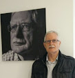
 Final result - the only thing left to decide is whether I will paint in a background (there is a red brick wall in the reference photo) or leave it stand.
I started out with a chosen photo, and reduced it in Photoshop to 16 colours, as is my normal practice. However, I did not use this posterized image as an underpainting on this occasion, but kept it beside me for reference as to the outlines of the value changes.
Subscribe to:
Posts (Atom)