Saturday, October 21, 2017

Hollyhocks

At the end of May I went to France for a stay, and took with me
a sketch for a painting of hollyhocks, based on a photograph that I took in France the previous year. I selected in advance the pastels I would need to finish the painting. 
This is the photograph:

And this is the selection of pastels: the reds are mainly Schminke and Blue Earth Quinacridone Pink. Greens are Sennelier, and you might spot a large violet Artisan Pastellier among them.


Progress was mainly from top to bottom, and left to right, with the stems of the hollyhocks forming a useful divisional map in what was really a mess of abstract shapes.


You might also notice some spotting on the flowers in the early stages: this is because I used Sennelier Pastelcard for this painting, and while it is an excellent sanded support, it must not get wet or the tooth falls off! I had left a window open in the studio during a rain shower, and the surface got spattered. Luckily I noticed it before any irreparable damage was done.


Hollyhocks © Niall O'Neill

Saturday, April 15, 2017

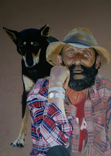
Mon pote le gitan

This gentleman was sitting quietly with his dog in the shade on a very hot day in Lacoste, Provence. He was wearing trainers, but had a fine pair of tooled leather boots at his side, one of which contained a bottle of wine. He kindly gave me permission to take a photograph., and I based this portrait on a cropped version of the photo.
This is the cropped photo, reduced in Photoshop to 16 colours.

I used this as a jigsaw of abstract  shapes to start the process in hard pastels and pencils.


This is the underpainting finished. I paid especial attention to the flow of the pattern in his shirt

The selection of soft pastels I used included flesh tones and golden ochre from Sennelier; blacks and blues from Rembrandt; reds from Sennelier, Schminke, and Roché.

Top half of the dog worked, and face commenced, keeping the top half and its colours away from the rest.

Beginning to fill in the pattern of the shirt with soft pastels, guided by the underpainting. Neck and beard also getting some touches.

The finished piece. I'm sorry I didn't ask his name.
Mon pot' le gitan un jour est parti
Et Dieu seul sait où il ballade sa vie
Mon Pote le Gitan © Niall O'Neill

Tuesday, March 21, 2017

Gondola Pastels

Thanks to a Japanese artist who posted their work on Facebook, I have been made aware of a pastel brand that is completely new to me, Gondola Pastels. Manufactured in Japan by an art materials company that has been in business since 1919, Gondola Pastels is a range of 242 colours, hand made in Kyoto, and size (Diameter x Length): 1.2 x 2.1 (cm) / 0.5 x 0.8 (inch)

They are available from Art Supplies Store, 1-1259-64 Shiomigaoka, Nakago-Cho, Kitaibaraki, Ibaraki 319-1553 JAPAN. The web address is http://www.art-supplies-store.com/product/6590.php

The 242 stick set, in a wooden box, costs $270, which seems good value.
The manufacturer's web page states: Gondola pastel is Japan's first soft pastel manufacturer that started business in Kyoto in 1919. For 90 years since our establishment, we have carefully created the colors according to the light of Japan one by one by hand.
In 2011, based on the idea of ​​Takiko Inoue, who received the Kyoto Culture Venture Competition First Prize , he created and launched " Kyoto Seki pastel" which gathered the traditional colors of Kyoto.

Sunday, February 19, 2017

Henri Roché pastels

Henri Roché Pastels 
For any practising pastellist, the basic rule is that you can never have enough pastels. If you had the the complete Roché set, now over 1200 and counting, you might just have reached that limit!

Roché Pastels have just updated their website to facilitate online purchase, or just to make available to view the complete range in order to see what you don't realise you need, or what is actually available! 

Henri Roché are the oldest extant pastel brand in the world, dating from around 1720 and used by artists such as Rosalba Carriera, and Edward Dégas. At its height in the 1970s, the entire range of Roché pastels exceeded 1800 colours. Today, Isabelle Roché and Margaret Zayer are busy expanding the collection that currently comprises 1201 colours, divided into ranges of nine gradations. Each range is composed of pure colours that are either gradated with white, black, or crossed with another colour.


Manufactured in small quantities, Roché pastels are individually hand-rolled into a form suitable for both bold and detailed work. With exceptionally lightfast pigments and a minimum of binder, the pastels possess a particular texture that allows them to adhere well to a number of supports, as well as display a remarkable intensity and clarity of colour. These are top of the range products, expensive, and not for the beginner. But the quality is superb and the personal service second to none. 

The full set of colours is visible here on the online shop. Look, lust, select, buy!

Thursday, February 2, 2017

Lilac Time

Many years ago I went to a musical production in the Cork Opera House based on the life and times of Franz Schubert. The whole production was so twee and artificial that I had to leave before I was ejected for guffawing throughout. It was called Lilac Time, so in humble apology to the players and producers, here is my take on same. 

The first sketch is on my easel. pencilling in the outlines and approximate colours.

Next you can see the base colours of the lilac flowers, (Derwent pencils in violet shades, and Unison pastels) and some definition being added to outline some blooms. I am also giving some consideration even at this early stage to the background (I'm muttering "purple and gold" to myself here).

The background is being taken over by raw sienna and umber (Rembrandt) and the highlighted outline on the petals is a very light grey from Carb-Othello. There is detail now on the vase, and the tray-cloth has the light direction made clear.

The cabinet top and the red drawers are added and the background completed -  as I thought.

I didn't like it . Neither did some of my Facebook artist friends - those who have the courage to contribute useful criticism. So I changed the background to a flat Golden Ochre from Schminke. Signed, and framed.
Lilac Time © Niall O'Neill


Sunday, January 22, 2017

Simply Red

The American artist David Leffel makes the point that all paintings have an underlying theme, other than the ostensible subject matter. So this pastel is about "redness", and I quote William Carlos Williams in my support:

so much depends
upon

a red wheel
barrow

glazed with rain
water

beside the white
chickens

The colander and lantern were selected for their blatant redness, while the Ch
âteau Pougeau is a Grand Cry Classé Margaux - i.e. a fine red wine.


First picture is the initial scribble in CarbOthello pencils and Rembrandt pastels.


I selected about 28 different red pastels in various tints and shades, mainly Sennelier, but some Roché and Schminke too. The colander is beginning to take form.


The holes in the colander were tedious to get right in terms of perspective. Here I am moving on to shading the left shadow side of the wine bottle, and beginning the lantern.

Nearing completion:


Final refinements on detail of objects. Deciding where to stop with the apples; adding the reflections; and using Sennelier 177 Dark Green on the background, which is black Canson Mi-Teintes, a paper I rarely use. 

A word about the composition: the overall shape of the arrangement is a triangle, echoed in the triangular layout of the apples in the colander. As well as that, there are numerous circles and arcs in the piece - the colander and the drainage holes therein; the apples of course; and various circular elements and arcs in the oil lamp. All of these elements help to tie the composition together.
Simply Red © Niall O'Neill