Monday, February 7, 2022

Brasserie

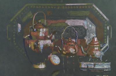
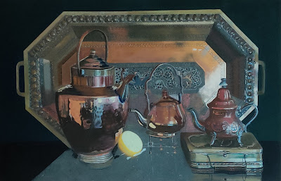
I have a collection of copper and brass pots and an intricate brass tray, that I wanted to paint as an ensemble. This is the set-up:


Using an editing program, I reduced the photo to 16 colours - I call this process the "digital squint" - equivalent to squinting your eyes to simplify an image and better determine the values.

Using the swatch, I chose the initial colours for the underpainting, and scribbled them in with pastel pencils and hard pastels.


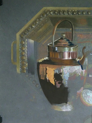
Working from top left, I started painting the corner of the tray, and the copper tea-urn. Rembrandt umbers were very useful.


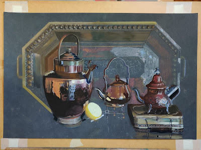
More pots worked on, and the lemon - what's tea without a lemon?


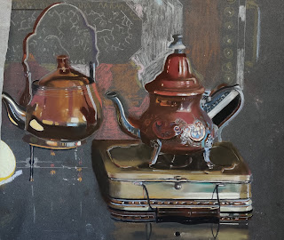
The copper tea-pot on the right had it's own colour swatch and subset of pastels:


Tray background begins to get filled in. I use glassine paper to protect areas already completed as I work.


Intricate detail of tray worked with various pencils and sharpened Rembrandts:


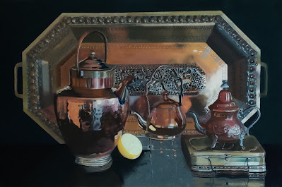
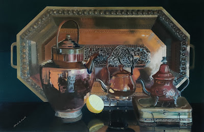
Reflections painted, final tweaks- signature! Pastels used were Rembrandt, Sennelier, Blue Earth and Roché
Brasserie - pastel on Pastelmat, 17.5 x 26.5 ins, 45 x 58 cms


Brasserie  © Niall O'Neill

Saturday, May 15, 2021

FUNGUS

I haven't posted here in a while. not because I haven't been painting, but because I have been exploring other mediums. However, after buying Dan Massad's Palmer Museum retrospective catalogue/monograph I thought I might like to try a stark image against a  black background - something I hadn't done before. This striking image of a fungus was taken by by Mick Grant, who kindly gave me permission to use it..

This is the initial sketch and scribbled infill using pastel pencils on a grid drawn only where the image will sit.


Much of the caps is completed using a variety of soft pastels, Rembrandt, Sennelier, and Roché, and a contrasting black background is filled in using pastel pencils around the edges of the mushrooms, with Rembrandt black pastel sharpened to a point.


I started work on the stems, using mostly Rembrandt grey, blue grey, mouse grey, and green grey, and extended the black background.


The background is extended fully and I began to cover the slightly greasy Rembrandt black with the softer, more matt, but also more dusty Roché black.

The bottom of the painting is not black, but very dark green, on which the mossy ground is painted.
"Fungus" © Niall O'Neill

This is the palette, colour chart, or "nuancier" that I used. It is quite extensive for such an apprently simple subject.


I framed the finished painting behind museum glass. It measures 14 x 11 inches, or 35.5 x 28 cms, and is painted on Clairefontaine Pastelmat.


Monday, October 7, 2019

Campsis after Rain

For the circumstances regarding this flower with raindrops, see previous post.
I'm going a little deeper into my method here. The first image is a photograph of the flowers reduced to 16 colours in Paint Shop Pro, with a 10 x 8 grid imposed (my support will be a 10 x 8 in. piece of Pastelmat).

Now you can use the colour palette in Paint Shop to make a swatch, so that the underpainting is reduced in complexity of colour although the tonal range is not altered.

I used this as basic palette to to the first sketch.

Followed by a bit of quick blending.

I usually select a subset of soft pastels to cover all potential colours and values in a painting. This is the selection, and the "nuancier". It includes Rembrandts (top left), Artisan Pastellier, Blue Earth yellows, some Schminke, and Senneliers, bottom rows.

I chose to give a pink bias to the top flower, and once done put in some background to see view the contrast. I used Sennelier dark green 177.

I decided to exaggerate the orange-yellow tints of the bottom flower.

Back to the top right, and the pinkish flowers, finish background, and sign. Job done!
Campsis after Rain © Niall O'Neill

Hibiscus after Rain

After two weeks of unremitting heat in early July, the temperature dropped from 39-40 degrees Celsius and it rained - just for a day - on July 26th. So I took some pictures of this Hibiscus Blue Bird (and a Campsis or Trumpet flower) and decided to paint it.
The first picture shows the support, some scribbled petals, and a colour chart of the few pastels used to get me to this point - CarbOthello in the main.


The pencils are fine for initial drawing, but not for painting, with the exception of the stigmas and pistil in the flower's centre. After checking all my blues, I decided on Sennelier 334, 335 and 336 as being the most suitable for colour and for a subtle movement of tone within the hue.


The dark centre was put in using Unison, and all the raindrops were outlined. The centre was enhanced with some subtle touches of very dark red from Roché. Once the petals were near completion I put in some Sennelier 434 dark blue to see how the background would show up the bloom.


It only remained to finish the leaves - not too much detail needed here -  finish the background, and sign! The finished piece is on Pastelmat, 10 x 8 ins or 25 x 20 cms.
Hibiscus after Rain © Niall O'Neill

Friday, March 15, 2019

Edgy about edges?


What are the essential elements that make up a painting? In no particular order, composition, drawing, perspective, values, edges, colour – all of these contribute to the outcome. Edges are arguably the least appreciated of these, but contribute greatly to the three-dimensionality of a painting that aims at being representational.
I was re-reading Charles Sovek’s “Catching Light in your Paintings” recently, in which he lists the four kinds of edges – Hard, Firm, Soft, and Lost.  Hard, and Lost, are probably the easiest on figure out.
Hard edges are clear, well-lit, in focus, and catch the eye.
Lost edges are valuable in all styles for taking bits of the picture out of focus, in contrast  with the bits that are sharp and meant to take the attention. Lost edges automatically occur when two edges share the same dark tone, even if the colours are different. I find them especially useful for getting edges that are on the shadow side lost in the dark background that l often use.

Soft edges occur when there is a transition of colour or value (tone) with no distinct margin – you can simply soften adjacent edges by blurring them or blending them together.

Firm edges are somewhere between hard and soft -  a distinct transition, but clearly neither sharp nor blurred.

The images below illustrate the different types of edge.

In the pastel with the Samovar and Tilly lamp, there are two light sources – the set-up is lit by a spot from the right, and the Tilley lamp has an internal light. 

The lemon is the brightest object, and as you go around the circumference you proceed from a Hard edge to a Soft edge – and internally there is a Soft edge between the half-tone and shadow. The reflection of the lemon goes from Firm to Lost. The samovar goes from Hard where it is highlighted, to Lost in the shadow, along its perimeter. Internally there are firm to soft passages. Likewise for the Tilley lamp, specially the top.


The Spanish coffee mill shows similar transitions in its edges to emphasise its three dimensionality.
I hope this clarifies the mystery of the edges!

Thursday, March 7, 2019

Tea for the Tillerman

Two diverse objects found in a French brocante. I can't resist brass, and the tea urn was a lovely large surface to paint. I associated the two, and put in a  lemon for a bright link and reflection.
First off, I scribbled in some undercolours with pencils and hard pastels.

Based on the undercoat, I chose a selection of pastels that would be the main workhorses for the next phase. As you might be able to make out, it's a varied range of ochres, yellows, and umbers, and draws from Artisan Pastellier, Blue Mountain (the square ones), Sennelier, Rembrandt and a few Caran d'Ache. You can make out a colour reference  on top.

Working from the top left, I started with the urn.

First overcoat on the lemon.

The lemon is large and bright, so  I needed to check its value and chroma against the mooted background colour (Sennelier dark greens 178 and 179). Also the light green in the lamp.

The lemon was too light in value overall, so that needed adjustment.

The background was completed, with a contrasting dark for the surface on which the objects were placed. Reflections were painted in, and this is when I realised I had a painting 42 cm wide by 48 cm high, with a lot of empty space on top. So I took off 6 cm from the top to make it square.

Tea for the Tillerman © Niall O'Neill

Wednesday, January 16, 2019

Coffee in style

I found an interesting porcelain and silver ewer at a brocante in France and teamed it up with a coffee-mill that had similar white porcelain with blue flowers. The lace worked as a traycloth.
I started off with a pencil scribble.


Then I filled in the interior of the coffee-mill with Sennelier neutral greys, and the exterior with Rembrandt light greys. The wooden box, and the handle,  were mainly painted with CarbOthello pencils.

For the ewer, the silver top and the base were a mix of Rembrandts, and CarbOthello pencils 704, 708 and 728 - I found number 704 especially useful. 

The blue markings on the porcelain were a mixture of dark blues from Sennelier 465; CarbOthello pencils 770, 400 and 430; and Derwent pencils ultramarine 29D and 29 F. 

The porcelain itself was mainly Rembrandt light greys, with some petit-Roché neutral-pale tones. But I mostly kept the Rochés for the lace, with Sennelier neutral greys too, mostly in the shadows.

I started the background with Sennelier dark blue 177.  

Backgound continued with Sennelier dark blue 463 at the bottom with an overlay of Sennelier green 156. White was reserved exclusively for the highlights.
Coffee in Style, pastel on Pastelmat, 50 x 60 cms.
Coffee in Style © Niall O'Neill